Color coordination is the backbone of stylish outfit creation, transforming even the simplest wardrobe pieces into fashion statements that capture attention and express personality. By understanding the principles of color theory and how to apply them to your clothing choices, you can create balanced, harmonious looks that reflect your personal style while making the most of your existing wardrobe. This comprehensive guide explores the science and art of color coordination in fashion, offering practical techniques for beginners and fashion enthusiasts alike who want to elevate their style through intentional color choices.

Understanding the Fashion Color Wheel: The Foundation of Color Coordination
The color wheel serves as the fundamental tool for understanding how colors interact and relate to one another in fashion. This visual representation provides a systematic approach to selecting color combinations that work harmoniously together, allowing you to create outfits with confidence and precision.

The Basic Structure of the Color Wheel
At its core, the color wheel consists of primary, secondary, and tertiary colors arranged in a circular format. The three primary colors-red, blue, and yellow-form the foundation of all other colors. When these primary colors are mixed, they create secondary colors: green (blue + yellow), orange (red + yellow), and purple (red + blue). Further mixing of primary and secondary colors produces tertiary colors such as blue-green or red-orange, completing the color spectrum represented on the wheel.
Warm vs. Cool Colors in Fashion
Colors are broadly categorized as either warm or cool, each conveying distinct emotional qualities and energy levels when incorporated into outfits. Warm colors include red, orange, and yellow, which radiate energy, vibrancy, and passion. These colors tend to visually advance, making them appear closer and more prominent in an outfit. Cool colors, on the other hand, encompass blue, green, and purple, evoking calmness, tranquility, and sophistication. These colors visually recede, creating a more subtle presence in your ensemble.
Color Temperature and Emotional Impact
Understanding the temperature and emotional associations of colors is crucial when planning outfits for specific occasions or desired impressions. Red, for instance, communicates passion and excitement, making it a bold choice for statement pieces. Pink conveys femininity and romanticism, while blue projects trust and reliability, explaining its popularity in corporate settings. By considering these emotional connotations, you can intentionally select colors that align with the message you wish to convey through your attire.
Essential Color Coordination Techniques for Fashion
Now that we've established a foundation in color theory, let's explore specific techniques for combining colors effectively in your outfits. These approaches provide systematic methods for creating visually appealing combinations while allowing for personal expression.

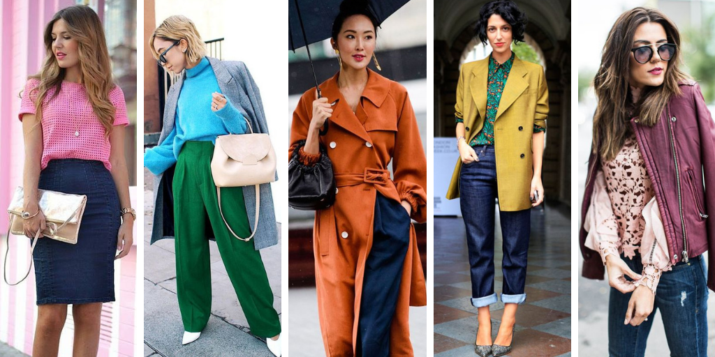
Complementary Color Combinations
Complementary colors sit opposite each other on the color wheel and create striking, high-contrast combinations when paired together. Classic complementary pairs include red and green, blue and orange, and yellow and purple. These combinations create visual vibration and energy, making them perfect for creating bold, attention-grabbing outfits.
When working with complementary colors, consider varying the intensity or shade of each color to create more sophisticated combinations. For example, while red and green might initially evoke Christmas associations, pairing a burgundy top with olive green pants creates a refined complementary look suitable for various seasons. The key is to experiment with different tints and shades within the complementary color relationship.
Analogous Color Schemes
Analogous color schemes utilize colors that appear adjacent to each other on the color wheel. This approach creates harmonious, cohesive outfits with a sense of unity and flow. For example, an analogous color scheme might include blue, blue-green, and green, or red, red-orange, and orange.
When implementing analogous color schemes, establish a primary base color and use the neighboring colors as accents that highlight rather than compete with the base. This technique works especially well with secondary and tertiary colors, allowing for subtle variations in hue while maintaining overall harmony in your outfit.
Monochromatic Styling
Monochromatic outfits employ different shades, tints, and tones of a single color family, creating sophisticated, cohesive looks with visual depth. This approach simplifies color coordination while creating elegant, streamlined ensembles. For example, a monochromatic blue outfit might pair navy pants with a sky-blue shirt and a medium-blue accessory.
The monochromatic approach is particularly effective for creating lengthening visual effects and projecting a polished, intentional appearance. By varying textures within the same color family, you can add dimension and interest to monochromatic outfits without disrupting their harmonious quality.

Working with Neutral Colors
Neutral colors-including black, white, gray, navy, brown, and beige-serve as versatile building blocks in any wardrobe. These colors work exceptionally well as foundations for outfits, allowing brighter accent colors to shine. Contrary to common misconception, neutrals can be mixed and matched with confidence; black pants with brown shoes or a navy blazer with gray trousers create sophisticated, grounded combinations.
Denim deserves special consideration as a neutral element in fashion. Consider denim a flexible neutral that pairs well with virtually any color, including other shades of blue. This versatility extends to mixing denim pieces of different washes-pairing mid-wash jeans with a light-wash denim shirt or dark-wash jeans with a mid-wash jacket creates visual interest while maintaining cohesion.
Identifying Your Personal Color Palette
Successfully coordinating colors in fashion begins with understanding which colors naturally complement your unique features. By identifying your personal color palette, you can select clothing that enhances your natural coloring, creating harmony between your complexion and your outfits.
Understanding Skin Undertones
The foundation of your personal color palette lies in identifying your skin's undertones-the subtle hues beneath your skin's surface that remain constant regardless of tanning or seasonal changes. Skin undertones generally fall into three categories:
- Warm undertones: Features golden, yellow, or peach hues beneath the skin's surface.
- Cool undertones: Displays pink, red, or blue hues beneath the skin.
- Neutral undertones: Exhibits a balanced blend of warm and cool qualities.
Several methods can help determine your undertones. Examine the veins on your wrist-blue or purple veins typically indicate cool undertones, while green veins suggest warm undertones. Alternatively, consider how your skin reacts to sun exposure-warm undertones often tan easily, while cool undertones may burn more readily. Your jewelry preferences can also provide clues-if gold jewelry enhances your complexion, you likely have warm undertones, while silver tends to flatter cool undertones.

Seasonal Color Analysis
Seasonal color analysis extends the concept of undertones by categorizing individuals into four seasonal types-Spring, Summer, Autumn, and Winter-each associated with specific color palettes that harmonize with your natural coloring.
Spring types typically have warm undertones with light features, flourishing in clear, bright colors like coral, peach, and warm yellows. Summer types possess cool undertones with soft features, appearing most luminous in dusty blues, lavenders, and soft pinks. Autumn types feature warm undertones with rich coloring, looking radiant in earthy tones like terracotta, olive, and rust. Winter types display cool undertones with high contrast between skin, hair, and eyes, shining in jewel tones like sapphire blue, emerald green, and true red.
Understanding your seasonal type provides a framework for selecting colors that naturally enhance your features, creating a visual harmony between your clothing and your inherent coloring.
Building a Versatile Wardrobe Using Color Theory
Armed with knowledge of color theory and your personal color palette, you can strategically build a versatile wardrobe that maximizes outfit possibilities while minimizing unnecessary purchases.
The Color-Coordinated Closet Structure
Organizing your closet according to the color wheel creates a visual system that simplifies outfit creation1.Arrange clothing items by color family, transitioning from one hue to the next according to their position on the color wheel. This approach allows you to quickly identify complementary and analogous color options when assembling outfits.
Within each color section, consider organizing pieces from light to dark or by garment type. This structured approach transforms your closet into a practical tool for applying color theory principles to daily dressing.

Core Neutrals and Statement Colors
A well-balanced wardrobe typically consists of core neutral pieces supplemented by strategic colored items. Begin by establishing a foundation of versatile neutrals-black, navy, gray, and beige pieces that mix and match effortlessly. These items serve as the canvas for more vibrant color expressions.
Next, incorporate colors that align with your personal color palette. Select a few statement pieces in your most flattering colors, along with accessories in complementary or analogous hues. This approach allows for maximum versatility while ensuring that each colored piece enhances your natural features.
The 60-30-10 Color Rule
Professional stylists often employ the 60-30-10 rule when creating balanced outfits. This principle suggests allocating approximately 60% of your outfit to a dominant neutral or base color, 30% to a secondary color, and 10% to an accent color or statement piece.
For example, a navy suit (60%) paired with a light blue shirt (30%) and a burgundy tie or scarf (10%) creates a visually balanced ensemble with appropriate color distribution. This formula provides a reliable structure for assembling cohesive outfits while incorporating visual interest through controlled color variation.
Color Coordination for Different Occasions
Different settings and occasions call for specific approaches to color coordination, with considerations ranging from professionalism to cultural context.
Professional Settings
In professional environments, color coordination often prioritizes sophistication and appropriateness while allowing for personal expression. Traditional business settings typically favor neutral foundations with controlled color accents. A charcoal suit paired with a pale blue shirt and burgundy tie, for instance, communicates professionalism while incorporating subtle color interest.
Creative professional environments offer greater flexibility for color expression. In these settings, monochromatic looks with bold accent colors or analogous color schemes can project creativity while maintaining professional polish. Consider a navy blazer with coordinating trousers, a teal shirt, and gold accessories for a creative yet polished appearance.
Casual and Weekend Wear
Casual settings provide opportunities to experiment more freely with color coordination. Complementary color combinations work particularly well for weekend wear, creating energetic, expressive outfits. A mustard yellow sweater paired with indigo jeans exemplifies this approach, combining opposites on the color wheel in a relaxed context.
For casual settings that still require some refinement, analogous color schemes create cohesive, intentional looks without appearing overly formal. Pairing olive green chinos with a golden-yellow t-shirt and a brown leather jacket creates a harmonious outfit suitable for casual dinners or social gatherings.
Formal Events and Special Occasions
Formal events typically call for sophisticated color coordination that respects traditional expectations while allowing for personal style. Classic black-tie events often limit color experimentation, focusing instead on texture and subtle color accents. For less restrictive formal occasions, monochromatic schemes in rich, saturated colors create elegant, memorable impressions.
Consider the event's specific context when selecting color combinations. Wedding attire, for instance, should complement rather than compete with the wedding party's color scheme. Seasonal considerations also influence appropriate formal color choices-deep jewel tones for winter events versus lighter, softer hues for spring and summer celebrations.

Trending Color Combinations for 2025
While timeless color theory principles remain constant, fashion continuously evolves with new color combinations gaining prominence each season. Staying informed about current color trends allows you to refresh your wardrobe strategically while maintaining alignment with your personal color palette.
Seasonal Color Trends
As of 2025, several color combinations have emerged as particularly influential in fashion circles. Orange and blue-specifically vibrant orange paired with deep blue-has gained popularity for its energetic contrast and visual impact. This combination appears frequently in both athleisure designs and evening wear, offering versatility across different fashion categories.
Earth tones continue their resurgence in 2025, with combinations of terracotta, olive green, and warm neutrals appearing throughout collections from major fashion houses. These colors reflect growing interest in sustainability and natural elements, creating grounded, harmonious ensembles.
Pastels with unexpected accents represent another significant trend, with soft lavenders, mint greens, and pale pinks paired with bold accessories in contrasting colors. This approach balances delicacy with visual interest, creating multidimensional outfits that capture attention while maintaining sophistication.
Incorporating Trends Thoughtfully
When incorporating trendy color combinations into your wardrobe, prioritize those that complement your personal color palette and existing pieces. Rather than investing heavily in trend-specific garments, consider introducing trending colors through accessories or single statement pieces that can be integrated with your core wardrobe items.
Evaluate trend relevance to your lifestyle and preferences before adoption. While orange and blue might constitute a striking combination in current fashion, this pairing may not serve your specific needs if these colors don't align with your personal palette or aesthetic preferences.

Experimenting with Bold Colors and Patterns
Once you've mastered basic color coordination principles, you can expand your fashion expression through more advanced color experimentation and pattern mixing.
Gradual Color Expansion
If you typically gravitate toward neutral palettes, consider gradually introducing color through the analogous method. Begin with a color that feels comfortable-perhaps light blue-then gradually incorporate adjacent colors on the wheel like teal or blue-violet. This incremental approach builds confidence in color coordination while expanding your comfort zone.
For those ready to embrace bolder expressions, experiment with complementary color combinations. The intentional contrast between opposites on the color wheel creates dynamic, attention-grabbing outfits. Start with muted or darkened versions of complementary pairs before progressing to more vibrant interpretations as your confidence grows.
Pattern Mixing with Color Consideration
Patterns introduce additional complexity to color coordination, requiring consideration of both the colors within patterns and how those colors interact with solid pieces in your outfit. When mixing patterns, establish a common color thread that connects different patterned elements. For instance, a floral blouse featuring navy and coral might pair harmoniously with navy pinstriped trousers, using the navy as a unifying element.
Scale variation creates successful pattern mixing-pair larger-scale patterns with smaller-scale designs to prevent visual competition. A bold, large-scale floral might complement a fine pinstripe or small polka dot, particularly when connected through a shared color palette.
Accessorizing with Strategic Color Choices
Accessories provide low-commitment opportunities to experiment with color theory principles and incorporate trending hues into your wardrobe.
Color-Blocking with Accessories
Accessories offer perfect vehicles for introducing complementary colors into otherwise neutral outfits. A cobalt blue handbag against a predominantly orange ensemble creates a striking color-blocking effect based on complementary relationships. Similarly, purple accessories paired with a yellow dress leverage color wheel opposites to create intentional visual tension.
Unlike garments, accessories don't need to match each other in color unless you're pursuing a monochromatic look. This freedom allows for creative expression through unexpected color combinations-pairing a red belt with green shoes and a yellow bag creates a playful, fashion-forward approach to accessorizing.
Metals as Color Elements
Metallic accessories-gold, silver, copper, bronze-function as colors within your outfit's overall scheme. Gold and copper contain warm undertones that harmonize with warm color palettes, while silver typically complements cool color schemes. Rose gold offers versatility across warm and cool palettes, providing a flexible metallic option.
Consider your outfit's color temperature when selecting metallic accessories. Gold jewelry enhances the warmth of autumn-hued ensembles, while silver accentuates the coolness of winter palettes. Mixed metals create contemporary, relaxed impressions when distributed thoughtfully throughout an outfit.
Common Color Coordination Mistakes to Avoid
Understanding potential pitfalls in color coordination helps you refine your approach and avoid common missteps that diminish outfit cohesion.

Overcomplicated Color Schemes
One frequent error involves incorporating too many unrelated colors within a single outfit. While color experimentation is valuable, limiting each outfit to three main colors-following the 60-30-10 distribution-typically creates more cohesive results. If incorporating additional colors, ensure they relate to your primary palette through common undertones or color family relationships.
Ignoring Color Intensity Balance
Balancing color intensity-the brightness or saturation of colors-proves as important as selecting appropriate hues. Combining multiple high-intensity colors without sufficient neutral elements often creates visually overwhelming outfits. Balance bright, saturated colors with neutrals or muted tones to create visual rest points within your ensemble.
Seasonal Disconnects
Colors carry seasonal associations that influence their contextual appropriateness. Neon colors and pastels traditionally align with spring and summer, while deeper, richer hues complement fall and winter wardrobes. While seasonal color rules have relaxed in contemporary fashion, extreme disconnects-like neon colors in deep winter or exclusively dark colors in high summer-can create disharmonious impressions.
Consider both the actual season and the color "temperature" when planning outfits. Winter white creates sophisticated cold-weather looks despite its light value, while jewel tones can transition into summer when rendered in lightweight fabrics and relaxed silhouettes.

FAQ: Color Coordination in Fashion
How do I determine which colors look best with my skin tone?
Identifying your skin's undertones provides the foundation for selecting your most flattering colors. Examine the veins on your wrist-blue veins typically indicate cool undertones, while green-appearing veins suggest warm undertones. Cool undertones generally look best in jewel tones, blues, purples, and true whites, while warm undertones harmonize with earth tones, peach, coral, and cream. If you have neutral undertones (a balance of warm and cool), you enjoy greater flexibility across the color spectrum. Professional color analysis can provide definitive guidance for those uncertain about their undertones.
Can I wear colors that are traditionally associated with different seasons?
Absolutely. While color theory suggests certain palettes align with specific seasons, contemporary fashion embraces flexibility in seasonal color application. The key lies in fabric selection and styling approach-summer colors can transition to winter through heavier textures and layering, while winter tones work in summer through lightweight fabrics and appropriate silhouettes. Consider incorporating traditionally "off-season" colors as accents rather than dominant elements when experimenting with cross-seasonal color wear.
How do I incorporate trendy colors if they don't typically flatter my coloring?
When trending colors don't naturally complement your coloring, strategic placement becomes essential. Keep unflattering colors away from your face, incorporating them instead through bottom pieces, accessories, or layered elements that maintain distance from your complexion. For instance, if a trending coral doesn't enhance your features, consider coral shoes or a handbag rather than a coral top. Alternatively, look for modified versions of trend colors-a deeper, muted version of a trend shade might harmonize with your coloring while still referencing current fashion directions.
Is it acceptable to wear the same color top and bottom (monochrome dressing)?
Monochromatic dressing creates sophisticated, elongating silhouettes when executed thoughtfully. For successful monochrome outfits, incorporate texture variation and subtle shade differences to create dimension. A monochromatic look in exactly matching pieces risks appearing flat or uniform-like, while variations in texture and tint create visual interest while maintaining color cohesion. Consider a navy wool blazer with navy silk blouse and navy cotton trousers-same color family with textural distinction.
How many colors should I incorporate into a single outfit?
The classic guideline suggests limiting outfits to three main colors, following the 60-30-10 distribution principle. Your dominant color should constitute approximately 60% of the outfit, a secondary color about 30%, and an accent color the remaining 10%. This framework creates balanced ensembles with clear visual hierarchy. That said, advanced style practitioners successfully incorporate additional colors through patterns or accessories that tie to the core palette, creating cohesive looks that transcend the three-color guideline.
Can I mix patterns that contain different colors?
Pattern mixing succeeds when patterns share at least one common color that creates visual connection. Before combining patterned pieces, identify overlapping colors within each pattern-a floral print containing blue and green might pair successfully with a striped piece featuring blue and white, with blue serving as the connective element. Additionally, vary pattern scale (combining larger patterns with smaller ones) and maintain some solid-colored elements to provide visual rest areas within the outfit.
How do I build a versatile wardrobe with a cohesive color story?
Begin by identifying your most flattering colors based on your personal color analysis, then select a foundation of neutral pieces that coordinate with your optimal palette. Add statement pieces in your signature colors, ensuring these items coordinate with multiple neutrals in your wardrobe. Consider creating mini capsule collections within your larger wardrobe-groups of 8-12 pieces in coordinating colors that mix and match to create numerous outfits. This approach maximizes versatility while maintaining a cohesive color narrative throughout your wardrobe.
The Psychology of Color in Fashion
Beyond aesthetic considerations, colors influence psychological and emotional responses, affecting both how you feel wearing certain colors and how others perceive you through your color choices.
Color and Mood Influence
Colors significantly impact emotional states and can strategically enhance or modify your mood through intentional selection. Red stimulates energy and confidence, making it valuable before presentations or negotiations requiring assertiveness. Blue promotes calmness and focus, benefiting high-stress days requiring sustained concentration. Yellow generates optimism and creativity, supporting brainstorming sessions or social gatherings where positive energy enhances outcomes.
By understanding these psychological effects, you can deliberately choose colors that support your emotional needs for specific activities or environments. This approach transforms your wardrobe into a tool for emotional regulation and psychological preparation.
Color and Social Perception
Color choices influence how others perceive and respond to you in social and professional contexts. Research indicates that red conveys dominance and confidence in professional settings, while navy blue communicates trustworthiness and reliability. Black projects authority and sophistication, explaining its prevalence in formal and business environments. Green suggests growth and balance, while purple historically associates with creativity and unconventional thinking.
Consider the impression you wish to create when selecting outfit colors for specific interactions. Job interviews might benefit from the trustworthiness of navy or the authority of black, while creative presentations might leverage the innovative associations of purple or the energetic quality of strategic red accents.

Conclusion: Developing Your Color Coordination Mastery
Color coordination in fashion represents both science and art-combining objective color theory principles with subjective personal expression to create meaningful visual narratives through clothing. By understanding fundamental concepts like the color wheel, color temperature, and coordination techniques, you establish a foundation for intentional, confident color selection.
Remember that color mastery develops through experimentation and observation. Begin with basic techniques like analogous or complementary combinations, then gradually incorporate more complex approaches as your confidence grows. Document successful combinations through photographs or wardrobe notes, creating a personal reference library of effective color pairings specific to your wardrobe and coloring.
Ultimately, the most successful color coordination reflects your authentic self-expression while respecting basic harmony principles. Your unique preferences, lifestyle needs, and personal coloring should guide your color choices, using color theory not as rigid rules but as flexible guidelines for creating your distinctive visual identity through fashion.
With practice and attention, color coordination becomes intuitive-a natural extension of your creative expression rather than a technical challenge. Embrace this journey of color exploration, allowing each outfit to refine your understanding of how colors interact with each other and with your unique features, creating a wardrobe that truly represents your personal style evolution.